Scores, Thresholds, and ROC Curves
The previous section evaluated classifiers after the decision was already made: the system assigned a label, and we counted outcomes. But most classifiers do not jump directly to a label. They produce a continuous score, a confidence value between 0 and 1, and the label emerges only after comparing that score to a threshold. The spam filter used later in this section assigns 0.90 to obvious junk, 0.10 to the legitimate email “Lunch plans?”, and 0.40 to the ambiguous spam message “Claim your reward points”. At threshold 0.5, the latter message stays in the inbox; at threshold 0.4, it moves to junk.
Different thresholds produce different confusion matrices, different precision/recall values, and different TPR/FPR trade-offs. A single classifier is not one point in metric space; it is a family of points, one for each threshold. This section explores how to visualize that family and choose a single operating point.
Score Distributions and the Threshold
A binary classifier assigns a score to each item . Items from the positive class tend to receive higher scores; items from the negative class tend to receive lower scores. If the two score distributions were perfectly separated (all positives above some value, all negatives below), any threshold between them would classify perfectly. In practice, the distributions overlap. Figure 1 visualizes how that overlap creates unavoidable false positives and false negatives.
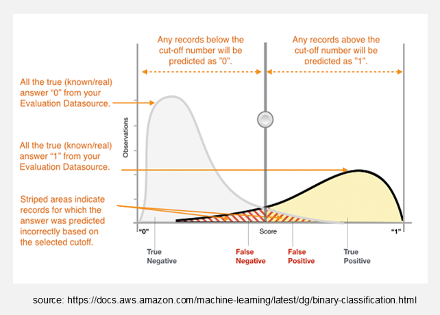
Figure 1:Score distributions for the negative class (grey) and positive class (yellow) with a decision threshold. The overlap region produces classification errors regardless of where the threshold is placed.
The threshold partitions the score axis into two regions: items with are predicted positive, items with are predicted negative. Moving the threshold changes the balance between true positives, false positives, true negatives, and false negatives:
Shifting to the left (lower threshold): more items cross into the “predicted positive” region. TPR increases (fewer false negatives), but FPR also increases (more false positives). The system becomes more sensitive but less specific.
Shifting to the right (higher threshold): fewer items are predicted positive. FPR decreases (fewer false positives), but TPR also decreases (more false negatives). The system becomes more specific but less sensitive.
This is the fundamental trade-off underlying every threshold-based classifier. No single threshold is universally best; the right choice depends on the error costs of the application.
Formalizing the Threshold as Areas Under the Distributions
Let denote the score distribution of the negative class and the score distribution of the positive class. Each classification rate corresponds to an area under one of these curves, partitioned by the threshold . Figure 2 shows the four resulting areas:
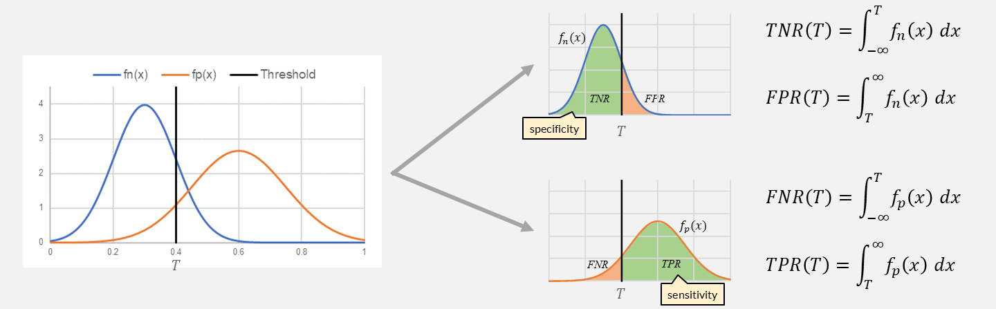
Figure 2:Decomposition of the score distributions into the four classification rates. TNR and FPR partition the negative-class curve ; FNR and TPR partition the positive-class curve .
The integrals make the trade-off precise. Shifting to the left expands the integration range for TPR (the area under to the right of grows), but simultaneously expands the integration range for FPR (the area under to the right of also grows). No threshold eliminates the overlap region; it can only choose how to distribute the overlap errors between false positives and false negatives.
The ROC Curve
Instead of evaluating one threshold, the ROC (Receiver Operating Characteristic) curve evaluates all of them simultaneously. It plots on the vertical axis against on the horizontal axis, sweeping from high to low. The result is a curve from to that shows the full trade-off landscape.
Figure 3 shows 20 emails (10 spam, 10 legitimate) sorted by descending spam score. At each score, we set the threshold there and count cumulative TP, FP, FN, TN. The right panel plots the resulting ROC curve.
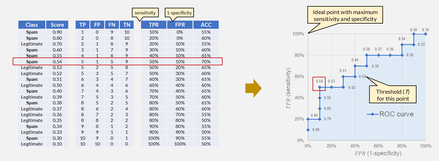
Figure 3:ROC curve construction from a ranked list of 20 emails. Each row sets the threshold at that score; the curve traces TPR vs. FPR as the threshold sweeps from high to low. The highlighted point (T = 0.54) has the highest accuracy but is not necessarily the best operating point.
Key Landmarks
| Point | Meaning |
|---|---|
| Threshold so high that nothing is predicted positive (always predict negative) | |
| Threshold so low that everything is predicted positive (always predict positive) | |
| Perfect classifier: all positives detected, no false positives | |
| Diagonal | Random classifier: TPR = FPR at every threshold (no discrimination) |
A curve that hugs the upper-left corner represents a strong classifier: it achieves high TPR before FPR rises appreciably. A curve that follows the diagonal adds no information beyond random guessing.
Reading the ROC Space
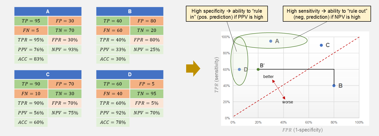
Figure 4:Four classifiers (A-D) mapped from their confusion matrices to ROC space. The upper-left region represents high sensitivity with low false-positive rate; the diagonal represents random performance.
Figure 4 places four classifiers at different operating points:
Classifier A (TPR = 95%, FPR = 30%): high sensitivity, moderate false-positive rate. If a negative prediction from A is almost certainly correct (high NPV), A can “rule out” the condition: a negative result is trustworthy.
Classifier B (TPR = 40%, FPR = 80%): below the diagonal. This classifier is worse than random. Flipping its predictions gives B’ (TPR = 60%, FPR = 20%), which is above the diagonal and usable.
Classifier C (TPR = 90%, FPR = 70%): high sensitivity but very high false-positive rate. It catches most positives but at enormous cost in false alarms.
Classifier D (TPR = 60%, FPR = 5%): high specificity, moderate sensitivity. If a positive prediction from D is almost certainly correct (high PPV), D can “rule in” the condition: a positive result is trustworthy.
The biometric face-unlock from Evaluating Text Classifiers would appear as a point near the left edge of ROC space: , . The requirement “FPR below 0.5%” constrains the operating point to a narrow vertical strip on the left side of the plot.
AUC: Area Under the ROC Curve
The ROC curve shows performance across all thresholds. Summarizing it into a single number gives the Area Under the Curve (AUC).
| AUC | Interpretation |
|---|---|
| 1.0 | Perfect separation: every positive scores higher than every negative |
| 0.5 | Random: scores carry no discriminative information |
| < 0.5 | Worse than random (flip predictions to improve) |
AUC is useful for comparing classifiers without committing to a threshold: a system with higher AUC has better score separation overall. However, AUC does not say which operating point the system will use in production, and two classifiers with the same AUC can have very different curves (one may be better at low FPR, the other at high TPR).
Choosing an Operating Point
The ROC curve shows what is possible. Selecting one point on it requires a decision criterion from outside the mathematics:
Maximize accuracy. Compute at each threshold and pick the maximum. This works when classes are balanced and error costs are symmetric. In the spam example from Figure 3, threshold 0.54 gives , , accuracy , the highest value in the table. But as we discussed, the spam filter should rather optimize for a low FPR while maintaining acceptable TPR, not simply maximize accuracy.
Constrained optimization. Fix one rate and optimize the other. The face-unlock requirement “” defines a vertical line on the ROC plot; the operating point is the highest TPR value at or to the left of that line. This is the standard approach when one error type has a hard cost limit.
Youden’s J-statistic. Maximize , which is the vertical distance from the diagonal (random classifier). The point with the highest is geometrically closest to the upper-left corner and balances sensitivity against specificity without committing to a cost model.
Equal error rate (EER). Find the threshold where (equivalently, ). This is the point where the ROC curve crosses the anti-diagonal from to . EER is commonly reported in biometric and speaker-verification systems as a single-number summary that does not require choosing which error is worse.
In all cases, threshold selection should be performed on a validation set separate from the test set used to report final metrics. Optimizing the threshold on the test set inflates reported performance.